Despite the fact that a lot of marketing has moved into the online world over the last decade-or-so, leaflets still remain one of the best ways to get the word about your product/service.
Leaflets are direct, informative and can be mass-produced relatively inexpensively (by printing companies such as www.solopress.com or www.fastprint.co.uk), making them perfect for large and small businesses alike.
However, in order for a leaflet to be an effective marketing medium, you need to pay attention to the design side of things, and that doesn’t just mean hiring a fancy graphic designer either.
It means knowing what makes a good, effective design, and what elements of a leaflet are likely to bring in results, rather than just looking pretty.
Below, I’ve rounded up some of the best, most gorgeous leaflet designs I’ve come across on the Internet to give you some inspiration.
#1 – Pact
Pact is a large capacity development corporation currently operating in more than 26 countries, and their leaflet design here is certainly one to be admired.
You’ll notice that the leaflet utilises a bold colour scheme (purple, predominantly) along with large bold typography and eye-catching imagery.
The genius of this leaflet design is just how clear and concise it is. Inside, it features the headline “building local promise.” which is then clearly explained in a short, to-the-point paragraph on the next fold.
It comes across as bold and energetic, yet also trustworthy and concise.
#2 – Wildlife Brigade
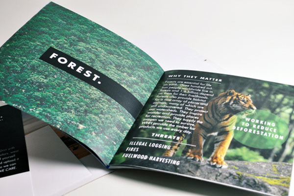
The Wildlife Brigade is all about “conserving places”, and this leaflet uses beautiful imagery to convey exactly the sort of places the organisation is referring to.
On the first page, you see a beautiful image of a forest with the bold headline “forest”. On the following page, the leaflet tells you why preserving the forest matters, and again uses bold and emotional imagery to help get the point across.
The intelligent part of this leaflet is not only the great use of imagery, however, but also the way in which it is set out.
It follows a logical format and everything is clearly divided and explained. Important points are given prominence via the use of bold typography (see “threats”).
#3 – Museum Mile
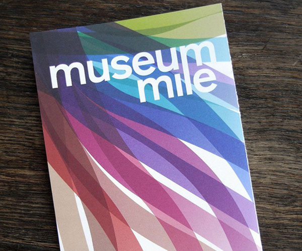
Museum Mile refers to the one-mile stretch in Central London, which is home to no less than 13 museums.
This leaflet aims to give visitors to the area all the information they need, yet it doesn’t do this in a boring way. It has been designed to catch your eye (hence the use of a beautiful, bright colours), yet also not overwhelm with information, as so many leaflets do.
Design-wise, it’s quite minimalistic, but this works well. The cover features nothing more than a bold title (“Museum Mile”), which is all it needs to say, really, as the subject nature of the leaflet is entirely obvious from this title alone.
#4 – Masala Darbar
Masala Dakbar is an Indian café and restaurant with a desire to stand out from the crowd by creating an unforgettable experience for their customers.
The leaflet (pictured above) is nothing short of a masterpiece; it’s clean, elegant, bright, and yet presents the information in an enticing and clear manner.
Initially, it’s the yellow/brown colour scheme of the leaflet that is likely to catch your eye, which prompts you to open it up. Upon doing so, you’re presented with the most refined menu possible, displayed in an organised yet visually enticing manner, despite the lack of traditional “food photos”.
#5 – Hole in the Wall
Hole in the Wall is a contemporary sandwich bar and café located in Sydney. The entire nature of their branding revolves around the concept of clean, contemporary minimalism, and this leaflet is no different.
It makes use of just two shades; black and white, and features an abundance of white space, which helps ensure that the text is as clear and readable as possible.
It’s a simple, elegant leaflet held together via the consistent use of colour, typography and styling. You’ll notice the “dotted line” running across each of the pages, which helps tie the overall design together.
#6 – Web Directions
Web Directions have taken a similar approach to Hole in the Wall here, by utilising lots of white space and clean typography.
Unlike the previous example, though, they’ve chosen to brighten things up with a splash of red alongside black and white, which really does wonders for the design.
Arrangement-wise, the leaflet is kept simple and consistent throughout, with the bold, uppercase headlines setting the scene for the page below.
#7 – Royal Veterinary College
The Royal Veterinary College has made excellent use of colour in this leaflet, as well as typography.
Blue is the predominant colour used throughout, which helps give a sense of branding to the leaflet, and also helps to tie the entire design together. However, there are other colours used throughout, which are generally used for important eye-catching points (e.g. quotes, as shown in the example above).
All headings/subheadings feature large, uppercase typography, with paragraph text being written in much smaller regular type. This gives a great sense of hierarchy within the design.
#8 – 2010 Epic Awards
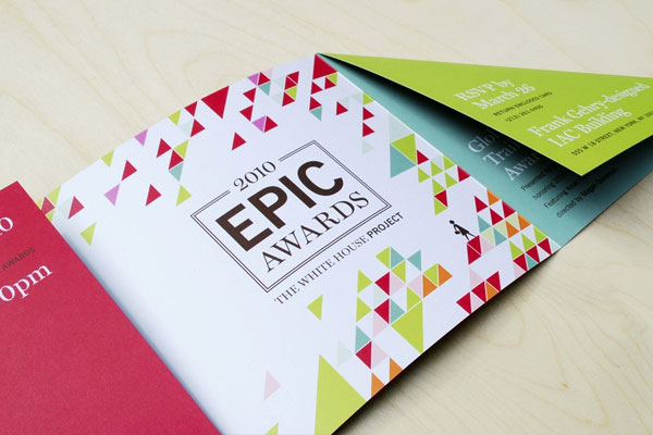
Designed for the 2010 Epic Awards Ceremony, this leaflet is perhaps one of the most beautifully designed leaflets of all time.
It makes stunning use of colour, although you’ll notice if you look closely that throughout, only a handful of colours are used. What’s more, red, green and blue are used in abundance, whereas other colours are simply used to break up the design.
Typography-wise, this leaflet is as good as it gets. It makes use of two typefaces; both of which pair together beautifully.
#9 – WWF Climate Change
WWF’s climate change leaflet (pictured above) had one purpose: to capture the attention of the audience and raise awareness of the issue at hand.
The designer opted for the use of large, bold typography to do this; which allowed the recipient to quickly glance at key issues, and it also gave a sense of the importance of those issues.
Clearly, the leaflet is predominantly black and white (i.e. black text on a white background), but the designer has also used a bright orange colour to accentuate important facts, figures and points.
It’s a beautifully designed leaflet that discuses important points with poise and elegance.
#10 – CHP
This leaflet was created on behalf of the Duke’s Centre for Healthy Policy (CHP), and it tackles important health-related issues.
Being serious in nature, it would have been quite easy for the designer to opt for a boring, bland design with a somewhat corporate feel to it, but clearly, the designer didn’t go for this.
Instead, we’re presented with a bright, eye-catching leaflet that manages to convey a sense of trust and seriousness, while also achieving a somewhat informational style.
The red and blue colour combination works beautifully well.


